前言
网页布局就是将网页根据不同的内容进行划分,这样做不仅可以美化网页外观,还可以让用户对你的网页功能一目了然,提升用户体验。
两列布局和三列布局是我们最常见的两种布局,我今天总结一下实现这两种布局的多种方式。本文代码没有考虑兼容性。
两列布局
侧栏宽度固定,左边内容部分宽度自适应。header和footer高度固定,具体如图: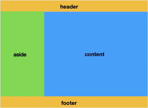
利用浮动来布局
<!DOCTYPE html>
<html lang="en">

<head>
    <meta charset="UTF-8">
    <meta name="viewport" content="width=device-width, initial-scale=1.0">
    <meta http-equiv="X-UA-Compatible" content="ie=edge">
    <title>Document</title>
    <style>
        * {
            margin: 0;
            padding: 0;
        }

        html,
        body,
        #app {
            height: 100%;
        }

        #header,
        #footer {
            height: 50px;
            background-color: burlywood;
            text-align: center;
            line-height: 50px;
        }

        #aside {
            height: calc(100% - 100px);
            width: 200px;
            text-align: center;
            background-color: aquamarine;
            float: left;
        }

        #main {
            height: calc(100% - 100px);
            width: calc(100% - 200px);
            background-color: #eee;
            text-align: center;
            overflow: hidden; //使其成为BFC,清除浮动,因为浮动也是一个BFC,两个BFC不会重叠
        }
    </style>
</head>

<body>
    <div id="app">
        <header id="header">header</header>
        <aside id="aside">aside</aside>
        <main id="main">main</main>
        <footer id="footer">footer</footer>
    </div>
</body>

</html>
利用绝对定位来布局
<!DOCTYPE html>
<html lang="en">

<head>
    <meta charset="UTF-8">
    <meta name="viewport" content="width=device-width, initial-scale=1.0">
    <meta http-equiv="X-UA-Compatible" content="ie=edge">
    <title>Document</title>
    <style>
        * {
            margin: 0;
            padding: 0;
        }

        html,
        body,
        #app {
            height: 100%;
        }

        #app {
            position: relative;
        }

        #header,
        #footer {
            height: 50px;
            background-color: burlywood;
            text-align: center;
            line-height: 50px;
        }

        #footer {
            position: absolute;
            bottom: 0;
            width: 100%
        }

        #aside {
            /* height: calc(100% - 100px); */
            width: 200px;
            text-align: center;
            background-color: aquamarine;
            position: absolute;
            left: 0;
            bottom: 50px;
            top: 50px;
        }

        #main {
            /* height: calc(100% - 100px); */
            width: calc(100% - 200px);
            background-color: #eee;
            text-align: center;
            position: absolute;
            right: 0;
            bottom: 50px;
            top: 50px;
        }
    </style>
</head>

<body>
    <div id="app">
        <header id="header">header</header>
        <aside id="aside">aside</aside>
        <main id="main">main</main>
        <footer id="footer">footer</footer>
    </div>
</body>

</html>
利用伸缩盒flex来布局
<!DOCTYPE html>
<html lang="en">

<head>
    <meta charset="UTF-8">
    <meta name="viewport" content="width=device-width, initial-scale=1.0">
    <meta http-equiv="X-UA-Compatible" content="ie=edge">
    <title>Document</title>
    <style>
        * {
            margin: 0;
            padding: 0;
        }

        html,
        body,
        #app {
            height: 100%;
        }

        #app {
            display: flex;
            flex-wrap: wrap;
        }

        #header,
        #footer {
            height: 50px;
            background-color: burlywood;
            text-align: center;
            line-height: 50px;
            flex-basis: 100%;
        }

        #aside {
            width: 200px;
            height: calc(100% - 100px);
            text-align: center;
            background-color: aquamarine;
        }

        #main {
            height: calc(100% - 100px);
            width: calc(100% - 200px);
            background-color: #eee;
            text-align: center;
        }
    </style>
</head>

<body>
    <div id="app">
        <header id="header">header</header>
        <aside id="aside">aside</aside>
        <main id="main">main</main>
        <footer id="footer">footer</footer>
    </div>
</body>

</html>
利用网格grid来布局
<!DOCTYPE html>
<html lang="en">

<head>
    <meta charset="UTF-8">
    <meta name="viewport" content="width=device-width, initial-scale=1.0">
    <meta http-equiv="X-UA-Compatible" content="ie=edge">
    <title>Document</title>
    <style>
        * {
            margin: 0;
            padding: 0;
        }

        html,
        body,
        #app {
            height: 100%;
        }

        #app {
            display: grid;
            grid-template-columns: 200px auto;
            grid-template-rows: 50px auto 50px;
            grid-template-areas: "header header" "aside main" "footer footer"
        }

        #header,
        #footer {
            background-color: burlywood;
            text-align: center;
            line-height: 50px;
        }

        #header {
            grid-area: header;
        }

        #footer {
            grid-area: footer
        }

        #aside {
            grid-area: aside;
        }

        #main {
            grid-area: main;
        }

        #aside {
            text-align: center;
            background-color: aquamarine;
        }

        #main {
            background-color: #eee;
            text-align: center;
        }
    </style>
</head>

<body>
    <div id="app">
        <header id="header">header</header>
        <aside id="aside">aside</aside>
        <main id="main">main</main>
        <footer id="footer">footer</footer>
    </div>
</body>

</html>
三列布局
两边侧栏宽度固定,中间内容部分宽度自适应。header和footer高度固定,具体如图: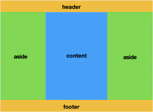
利用浮动float来布局
float元素是有浮动范围的,在它的包含块中,如果它之前有内容,会阻止它向上浮动,因此在不要求content元素首先渲染的情况下我们才会用浮动布局,因为此时content元素必须位于浮动元素下方。
<!DOCTYPE html>
<html lang="en">

<head>
    <meta charset="UTF-8">
    <meta name="viewport" content="width=device-width, initial-scale=1.0">
    <meta http-equiv="X-UA-Compatible" content="ie=edge">
    <title>Document</title>
    <style>
        * {
            margin: 0;
            padding: 0;
        }

        html,
        body,
        #app {
            height: 100%;
        }

        #header,
        #footer {
            height: 50px;
            background-color: burlywood;
            text-align: center;
            line-height: 50px;
        }

        #aside1,
        #aside2 {
            height: calc(100% - 100px);
            width: 200px;
            text-align: center;
            background-color: aquamarine;
        }

        #aside1 {
            float: left;
        }

        #aside2 {
            float: right;
        }

        #main {
            height: calc(100% - 100px);
            background-color: #eee;
            text-align: center;
            overflow: hidden;
        }
    </style>
</head>

<body>
    <div id="app">
        <header id="header">header</header>
        <aside id="aside1">aside</aside>
        <aside id="aside2">aside</aside>
        <main id="main">main</main>
        <footer id="footer">footer</footer>
    </div>
</body>

</html>
利用absolute定位来实现布局
<!DOCTYPE html>
<html lang="en">

<head>
    <meta charset="UTF-8">
    <meta name="viewport" content="width=device-width, initial-scale=1.0">
    <meta http-equiv="X-UA-Compatible" content="ie=edge">
    <title>Document</title>
    <style>
        * {
            margin: 0;
            padding: 0;
        }

        html,
        body,
        #app {
            height: 100%;
        }

        #app {
            position: relative;
        }

        #header,
        #footer {
            height: 50px;
            background-color: burlywood;
            text-align: center;
            line-height: 50px;
        }

        #footer {
            position: absolute;
            bottom: 0;
            width: 100%
        }

        #aside1,
        #aside2 {
            /* height: calc(100% - 100px); */
            width: 200px;
            text-align: center;
            background-color: aquamarine;
        }

        #aside1 {
            position: absolute;
            left: 0;
            bottom: 50px;
            top: 50px;
        }

        #aside2 {
            position: absolute;
            right: 0;
            bottom: 50px;
            top: 50px;
        }

        #main {
            /* height: calc(100% - 100px); */
            width: calc(100% - 400px);
            background-color: #eee;
            text-align: center;
            position: absolute;
            right: 200px;
            bottom: 50px;
            top: 50px;
        }
    </style>
</head>

<body>
    <div id="app">
        <header id="header">header</header>
        <main id="main">main</main>
        <aside id="aside1">aside</aside>
        <aside id="aside2">aside</aside>
        <footer id="footer">footer</footer>
    </div>
</body>

</html>
利用flex和grid布局
它们的布局方式与两列布局时的方式大同小异,这里就不多加阐述。
圣杯布局和双飞翼布局
我们来总结一下实际网页三列布局中会用的两种布局:圣杯布局和双飞翼布局,具体如图: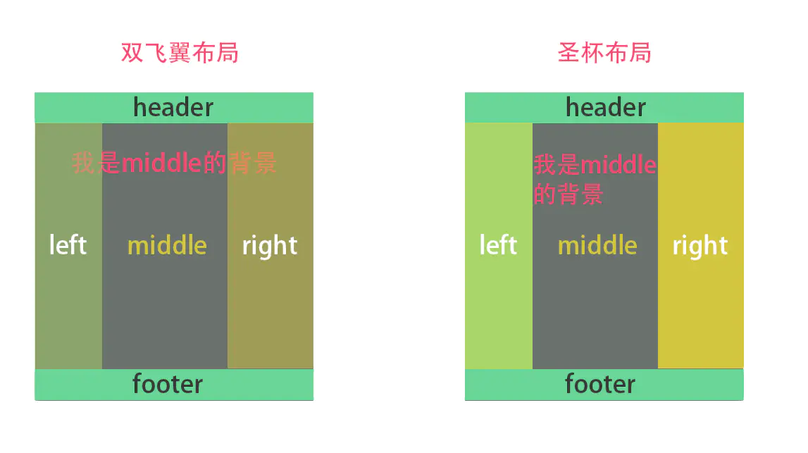
圣杯布局
为了中间content不被遮挡,为外层section设置了padding,使得边侧栏有地方放。且利用了margin为负对浮动元素的影响。
<!DOCTYPE html>
<html lang="en">

<head>
    <meta charset="UTF-8">
    <meta name="viewport" content="width=device-width, initial-scale=1.0">
    <meta http-equiv="X-UA-Compatible" content="ie=edge">
    <title>Document</title>
    <style>
        * {
            margin: 0;
            padding: 0;
        }

        html,
        body,
        #app {
            height: 100%;
            min-width: 600px
        }

        #header,
        #footer {
            height: 50px;
            background-color: burlywood;
            text-align: center;
            line-height: 50px;
        }

        section {
            padding: 0 200px;
            height: calc(100% - 100px);
            /* height: 100px; */
        }

        #main {
            float: left;
            background-color: #eee;
            text-align: center;
            height: 100%;
            width: 100%;
        }

        #aside1,
        #aside2 {
            float: left;
            width: 200px;
            height: 100%;
            background-color: aquamarine;
            position: relative;
            text-align: center;
        }

        #aside1 {
            left: -200px;
            margin-left: -100%;
        }

        #aside2 {
            right: -200px;
            margin-left: -200px;
        }
    </style>
</head>

<body>
    <div id="app">
        <header id="header">header</header>
        <section id="section">
            <main id="main">main</main>
            <aside id="aside1">aside1</aside>
            <aside id="aside2">aside2</aside>
        </section>
        <footer id="footer">footer</footer>
    </div>
</body>

</html>
双飞翼布局
<!DOCTYPE html>
<html lang="en">

<head>
    <meta charset="UTF-8">
    <meta name="viewport" content="width=device-width, initial-scale=1.0">
    <meta http-equiv="X-UA-Compatible" content="ie=edge">
    <title>Document</title>
    <style>
        * {
            margin: 0;
            padding: 0;
        }

        html,
        body,
        #app {
            height: 100%;
        }

        #header,
        #footer {
            height: 50px;
            background-color: burlywood;
            text-align: center;
            line-height: 50px;
        }

        section {
            float: left;
            height: calc(100% - 100px);
            width: 100%;
            /* height: 100px; */
        }

        #main {
            background-color: #eee;
            text-align: center;
            height: 100%;
            margin: 0 200px;
        }

        #aside1,
        #aside2 {
            float: left;
            width: 200px;
            height: calc(100% - 100px);
            background-color: aquamarine;
            text-align: center;
        }

        #aside1 {
            margin-left: -100%;
        }

        #aside2 {
            margin-left: -200px;
        }
    </style>
</head>

<body>
    <div id="app">
        <header id="header">header</header>
        <section id="section">
            <main id="main">main</main>
        </section>
        <aside id="aside1">aside1</aside>
        <aside id="aside2">aside2</aside>
        <p style="clear:both"></p>
        <footer id="footer">footer</footer>
    </div>
</body>

</html>